What "GSM" Actually Measures
GSM stands for grams per square meter: the weight of one square meter of a given sheet, regardless of how large or small the actual page is cut down to. It is a measure of density more than thickness, though the two tend to travel together. A standard photocopier sheet usually sits around 80 gsm. A greeting card runs closer to 300. Between those two numbers is most of what a person writing a personal letter will ever need to choose from — and the gap between the low and high end of that range is large, roughly the difference between a page you can read a headline through and one that could stand upright on its own.
A Quick Way to Judge an Unfamiliar Sheet
Hold it up to a window before writing on it. If you can read print through the sheet from the other side, ink is likely to show through as well — a sign to write on one side only, or to reach for a drier pen.
The Weight You Feel Before You Read
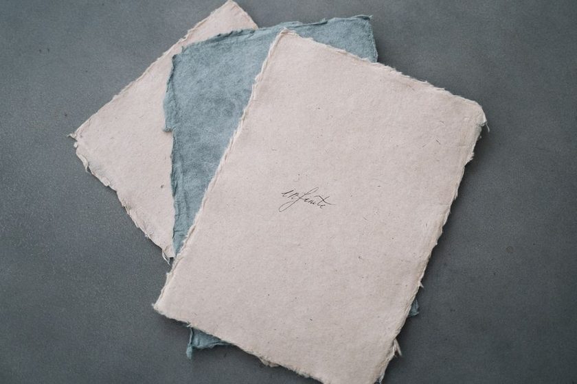
Paper weight reaches the reader before the message does, because touch is faster than reading. A sheet that flexes and sways when held up announces itself as casual, maybe even provisional — a note written between other things. A sheet with real body in it, one that holds its shape when a corner is lifted, reads as considered, even when the words inside say nothing more than a quick hello. Neither impression is correct or incorrect on its own. But it arrives first, and it colors everything that follows.
"Before I read a word of it, I already have a rough sense of how long she meant to write. The thin airmail sheets are for someone who has more to say than room to say it in. The card stock is for someone who decided, before picking up a pen, that the sentence would be short."— a longtime pen pal, describing a friend's habits
That instinct is not mysterious. It is close to the way a heavier envelope always seems to promise better news, or the way a printed notice on flimsy paper reads as less official no matter what the type on it says. Weight sets an expectation, and the words that follow either meet it or work against it.
A Practical Range for Personal Letters
Most personal correspondence lives in a narrow, fairly forgiving band. Below roughly 70 gsm, ink tends to show through from the reverse side, which limits a sheet to one-sided writing or a lighter touch with the pen. Above about 150 gsm, a sheet stops behaving like paper and starts behaving like board — it resists a clean hand fold and generally needs a scored line instead of a crease. The table below is a rough map of that middle ground, not a rule anyone has to follow to the gram.
| Weight (gsm) | Common name | Typical use | How it feels |
|---|---|---|---|
| 60–70 | Onionskin / airmail | Multi-page letters mailed a long distance | Nearly see-through, whispers when handled |
| 90–100 | Standard writing paper | Everyday personal letters | Holds ink without much show-through |
| 120–150 | Heavy bond / correspondence stock | Short notes, thank-yous | Firm, resists curling in a pocket |
| 220–300 | Cover stock / cardstock | Invitations, single-fold cards | Doesn't fold cleanly without scoring |
| 300+ | Cover board | Not meant to be folded at all | Cracks or whitens along any crease |
The Two Extremes: See-Through and Unfoldable
At the low end, weight becomes almost nothing at all. Onionskin and airmail papers, once common for letters that had to cross oceans under a weight-priced post, run thin enough to read a return address through from the back of the sheet. That transparency was never a flaw — it let a writer fit several pages into the weight allowance of one or two — but it also means the sheet shows every fold, every smudge, every place a pen pressed a little too hard. There is nowhere for a mistake to hide.
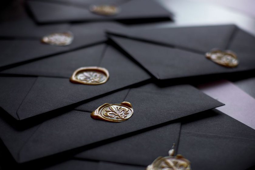
At the high end, weight becomes structure. Cover stock and card-weight sheets, the kind used for invitations and sturdier notecards, resist the fold that most personal letters rely on. Try to fold one by hand and the crease often cracks or whitens rather than lying flat, which is part of why heavier stock tends to travel flat inside a card-sized envelope instead of folded into an ordinary one — a habit we look at more closely in our piece on the tri-fold and its discontents. Past a certain weight, the sheet is no longer asking to be folded at all.
Matching Weight to the Occasion
None of this is fixed by rule, but a few patterns hold across most personal correspondence:
- A quick note between friends tends to feel right on lighter stock, close to standard writing paper — anything heavier can seem oddly formal for a short hello.
- A letter meant to be kept, reread, or saved in a drawer often carries more body, as if the paper itself is signaling that the writer expected it to last.
- A multi-page letter sent any real distance benefits from lighter sheets, which keep the finished envelope from feeling like a small brick in the mailbox.
- A single card marking an occasion usually calls for heavier stock, sent flat rather than folded, since it holds up better to handling and display.
What the Weight Can't Tell You
Weight sets a first impression, but it does not finish the job. A heavy, costly sheet with three rushed lines on it still reads as three rushed lines once the paper stops being new information. The stock buys the letter an opening; the sentences have to do the rest. Something similar happens with timing — a reply that arrives within a day or two carries a kind of weight of its own, independent of the paper it is written on, a pattern we looked at more closely in our piece on the forty-eight-hour reply. Paper and pacing are both first impressions. Neither one substitutes for what actually gets written.