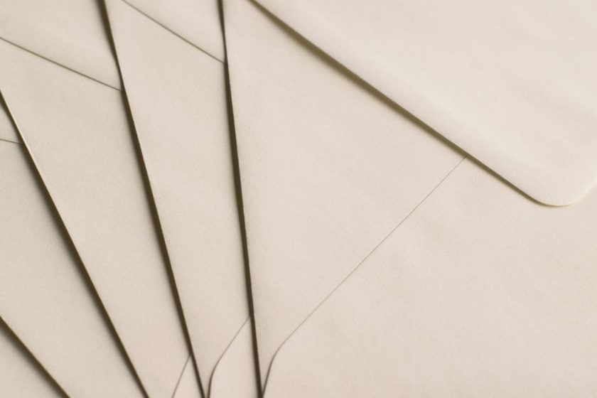
Hold an envelope up to a bright window before you open it, and most paper goes faintly see-through — enough, in strong light, to make out the shape of a signature or the corner of a check. Someone solved that problem long ago with a second sheet: thin, patterned, glued just inside the flap, whose only job is to interrupt the light. It never touches the letter itself, and almost nobody reads it. Yet it is often the first thing a thumb feels once the flap lifts — and, for a certain kind of correspondent, the first small announcement of who is writing, before a single word is visible.
A Problem Nobody Mentioned Out Loud
Before window envelopes and cheap photocopying became standard, a mailed document carried real exposure. A bank statement, a legal notice, a check folded into thirds — held to a lamp, its contents could be read from outside a plain envelope well enough to matter. Offices that handled money or contracts specified a lined envelope as a baseline, not an upgrade. The lining did one job: break up the light passing through the outer sheet so that whatever sat inside stayed a shape rather than a sentence.
What's Actually Glued In There
The lining itself is usually a lightweight tissue, printed with a dense repeating pattern — a lattice of diamonds, a fine crosshatch, sometimes a scatter of small shapes — in one or two ink colors, most often navy, gray, or a muted red. It is glued only along a narrow strip near the top, so the rest hangs loose inside the sleeve rather than bonding flat to the paper. That loose fit matters: a lining glued down its whole surface would stiffen the envelope and telegraph what's underneath through pressure and shadow, which defeats the purpose. The pattern has to be dense enough that no gap in the ink lines up with whatever's printed on the letter — which is why the better ones look almost busy up close, more static than decoration.
When the Function Faded, the Habit Stayed
Concerns about see-through mail eased over the decades — better opaque stocks, fewer loose paper checks, fewer people actually holding envelopes up to lamps. But by the time the functional need had mostly gone, the lining had become something people expected to find, the way a heavier stock signals that a letter was worth the extra grams. Stationers kept printing them because customers noticed the absence more than the presence. An unlined envelope, once the industry default, started to read as plain — sometimes on purpose, for business mail that wanted to look unadorned, and sometimes just as the cheaper option.
The Lining as a Small Signature
This is where the pattern stops being about privacy and starts being about taste. A torn flap gives a half-second flash of color before the letter itself comes out — cobalt lattice, faded rose marbling, or plain kraft with no lining at all. None of it is legible information, and none of it was meant to be read the way the fold or the handwriting will be. But it registers. A dense corporate diamond pattern in navy says something different from a soft floral tissue picked off a boutique shelf, and both say something different from no lining at all. The sender rarely treats it as a decision in the moment; they buy the box of envelopes that looked right to them. It just sits there, ahead of the actual sentence, quietly setting the register.
The letter hasn't said anything yet, and already the flap has told you how formal to expect it to be.— Letterfold
Hold an unopened lined envelope up to a lamp and the pattern shows through faintly from the outside — a ghost of the lattice under the outer paper. That ghost is the whole mechanism at work: it diffuses light rather than blocking it, which is why even a good lining still lets some shape through in bright conditions. It was never built to be perfect. Just enough.
A Short Taxonomy of Linings
Not every pattern does the same job, and the differences track fairly closely to era and intent:
| Lining type | Most common era | What it tends to signal |
|---|---|---|
| Dense diamond or lattice tint (navy, gray) | Early–mid 20th century; still common on business envelopes | Formality, discretion |
| Marbled or floral tissue | Victorian correspondence; revived by boutique stationers | Personal taste, occasion |
| Solid single-color tissue | Mid-century social stationery | Understatement, a house color |
| Kraft or unlined | Everyday and bulk business mail | Function only; no signal intended |
| Custom letterpress pattern | Small independent stationers, present day | A deliberate, collectible detail |
The pattern also keeps doing a little quiet, non-decorative work even now, mostly by accident of habit:
- It softens the sound of tearing — a lined flap tends to rip with less of a sharp crack than bare paper.
- It adds a faint stiffness that keeps a thin outer envelope from folding limp in a stack of mail.
- It gives a sorting eye something to catch on — a flash of pattern reads as "not routine mail" from several feet away.
Noticing One
Most of this goes unnoticed on purpose. A lining that draws attention to itself instead of to the letter has usually gotten the balance wrong — the design assumes it will be felt, glimpsed, and forgotten within the same motion of opening. That's an unusual kind of craftsmanship: made to be seen exactly once, by exactly one person, for about a second.
-
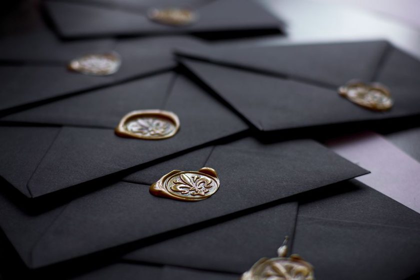
Wafer Seals, a Short History
Before wax sticks and signet rings, a thin disc of gum did the job of keeping a secret shut.
Sealing -
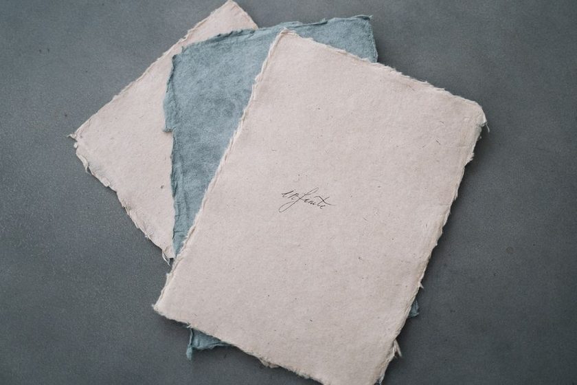
Deckle Edges and the Torn Look
The ragged border isn't damage — it's how paper used to be made, and why some mills still fake it.
Materials -
The Postscript as Second Thought
The line after the signature carries more than it should — a short study of the P.S.
Etiquette